
What belongs on your event page
Visitors decide in fifteen seconds whether to keep reading. This is the order they look for information, and what they usually can't find.
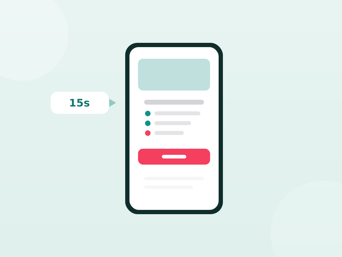
Someone clicks a link in a newsletter and lands on your event page. Within fifteen seconds they decide whether to read on or click away.
In those fifteen seconds they look for three things: what this is, when and where it is, and what it costs. If one of those isn't immediately visible, they start searching — and searching is where you lose visitors.
The order people read in
What it is. Not the name of the event, but what happens. "Annual Conference 2026" says nothing; "A day on public procurement for municipal buyers" says everything.
When and where. Date, time, place. At the top, not under a "practical information" heading halfway down.
What it costs. Even when it's free. "Free" is a selling point and belongs in view.
Who it's for. People want to know whether they belong there. One sentence will do.
What actually happens. The programme, with names and times. This is what converts the undecided.
How to register. A button, not an email address.
What's most often missing
An end time. Nearly every page gives the start; far fewer say when it finishes. For anyone travelling or collecting children, that's the deciding detail.
What's included. Is lunch part of it? Is parking free? At a business event costing a hundred and fifty euros, that isn't a detail.
How to get there. An address isn't a travel instruction. Two lines about the train and one about parking belong there.
Speaker names. "Various speakers from the field" sells nothing. One name your audience recognises does more than three paragraphs about the format.
Write for the phone
Most traffic to event pages comes from phones, often via a link in a group chat or a newsletter. What reads as a tidy three-column layout on a desktop becomes a long ribbon on a phone, with the programme disappearing off the bottom.
The test is simple: open your own page on your phone and don't scroll. Is what it is, when, where and what it costs all there? If not, some of your visitors start at a disadvantage.
Write the confirmation email just as carefully
The page convinces, but the confirmation email is what people keep. At most events that's an automated message with an order number and nothing else.
Put in what someone needs on the day: date and time, the address with travel advice, when it finishes, and who to call if something comes up. That's the email people dig out on the train, and it determines whether they arrive on time and in the right place.
Attach a calendar file. One click and it's in the diary someone actually looks at — the cheapest defence against no-shows there is.
Keep it current to the last day
A page still saying "programme to follow" two weeks out costs you registrations in exactly the period when most decisions get made.
And afterwards: leave the page up, but add what happened and when the next edition is. That page keeps drawing search traffic, and that traffic is precisely your audience for next time.
Read on
More articles
 Ticket sales
Seven reasons visitors don't finish buying their ticket
On average more than half of visitors drop out between picking a ticket and paying. These are the points where they leave, and what to do about it.
 Ticket sales
Early-bird pricing only works with a real deadline
Ticket rounds don't sell because they're cheaper, they sell because they end. How to structure them without giving away revenue.
 Ticket sales
How do you price a ticket?
Cost plus margin doesn't work for events. Four ways to arrive at a price, and why the cheapest is rarely the best.
From request to invoice in one platform
Try MiceBird free for fourteen days. Your offering in it, your branding around it — no implementation project.